In the world of jewelry design, the concept of weight extends far beyond the physical heft of a piece. It delves into the psychological and aesthetic realms, where visual weight and actual weight engage in a delicate dance. This balance is not merely a technical consideration but an art form in itself, one that distinguishes exceptional jewelry from the merely functional. Designers must navigate this interplay with precision, ensuring that a piece feels substantial yet wearable, impressive yet comfortable. The mastery of this equilibrium is what transforms raw materials into objects of desire, connecting the wearer to the piece through both touch and sight.
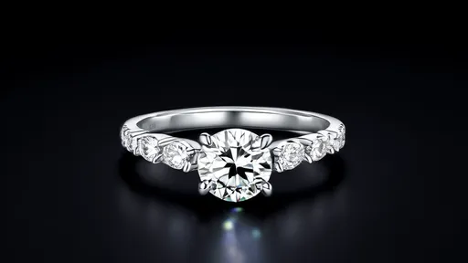
The term visual weight refers to the perceived mass or density of a jewelry item as interpreted by the eye. It is influenced by factors such as size, color, texture, and composition. A large, dark-colored gemstone may appear heavier than a lighter-colored one of the same size, while intricate metalwork can add a sense of density without increasing physical mass. Conversely, actual weight is the measurable mass of the piece, determined by the materials used—precious metals, gemstones, and other components. The challenge for designers lies in harmonizing these two aspects: creating pieces that look substantial and luxurious without being cumbersome or impractical to wear.
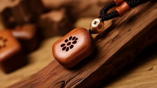
Historically, jewelry has often emphasized opulence through sheer physical weight. Think of royal crowns or ceremonial pieces, where the abundance of gold and gems conveyed power and status. However, modern wearability demands a more nuanced approach. Today’s consumers seek jewelry that makes a statement without sacrificing comfort. This shift has propelled designers to innovate, using techniques like hollow construction, lightweight alloys, and strategic setting to reduce actual weight while maintaining a bold visual presence. The result is jewelry that feels as good as it looks, marrying tradition with contemporary needs.
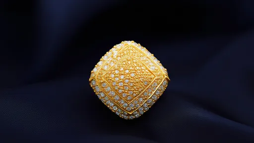
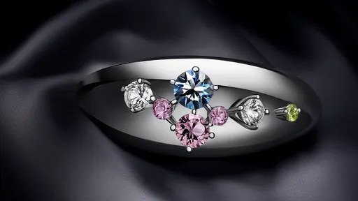
Color plays a pivotal role in manipulating visual weight. Darker hues, such as deep blues, emerald greens, or black diamonds, tend to absorb light and appear denser. In contrast, lighter colors like white gold or clear crystals can create an illusion of lightness and airiness. Designers often use color contrasts to balance a piece—for example, pairing a dark central gem with a lighter setting to distribute visual weight evenly. This technique ensures that the eye moves gracefully across the piece, avoiding a top-heavy or unbalanced appearance.
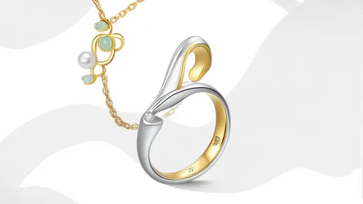
Texture and finish further influence perceived weight. A highly polished surface reflects light, creating a sense of brightness and reducing visual density. Matte or brushed finishes, on the other hand, absorb light and can make a piece seem more substantial. Combining textures allows designers to guide the viewer’s eye and create dynamic contrasts. For instance, a textured band might ground a piece, giving it stability, while a polished gemstone draws attention upward, creating a sense of elevation without added mass.
The size and scale of components are equally critical. A single large stone may dominate a design, lending it significant visual weight, but if poorly balanced, it can feel awkward or unstable. Designers often counterbalance such elements with strategic placements—using smaller accent stones, intricate metalwork, or asymmetric designs to distribute visual interest. This approach ensures that the piece feels cohesive and harmonious, rather than overwhelming or disjointed. The goal is to create a narrative within the design, where each element contributes to the whole without competing for dominance.
Material choice is at the heart of balancing actual weight. Precious metals like platinum and gold are dense and heavy, which can limit wearability in larger pieces. To address this, designers might use thinner gauges of metal or incorporate lightweight alternatives such as titanium or ceramic. Advanced techniques like 3D printing allow for intricate, hollow structures that reduce mass without compromising durability. Similarly, gemstones with high specific gravity, like diamonds or sapphires, can be set in ways that minimize their bulk, such as bezel settings that secure the stone without adding extra metal.
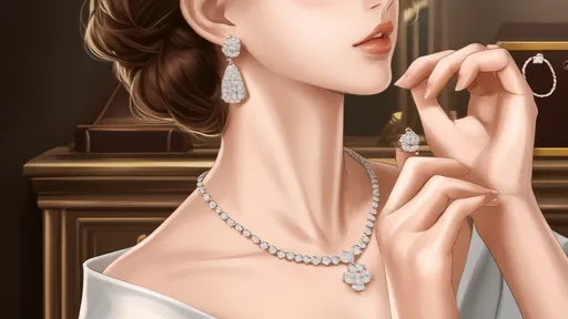
The wearer’s experience is paramount. Jewelry that is too heavy can cause discomfort, leading to fatigue or even skin irritation. Conversely, pieces that feel too light might be perceived as cheap or insubstantial. Designers must consider how a piece will interact with the body—how it will move with the wearer, how it will feel against the skin, and how its weight distribution affects comfort. This human-centric approach requires prototyping and testing, ensuring that the final product delights both the eye and the hand.
Cultural and contextual factors also shape perceptions of weight. In some traditions, heavy jewelry symbolizes wealth and endurance, worn for special occasions where discomfort is secondary to display. In everyday wear, however, lightness is often prized. Designers must navigate these expectations, creating pieces that resonate with their intended audience. A wedding ring, for example, should feel substantial enough to signify commitment yet light enough for constant wear. This cultural sensitivity adds another layer to the designer’s task, blending aesthetics with symbolic meaning.
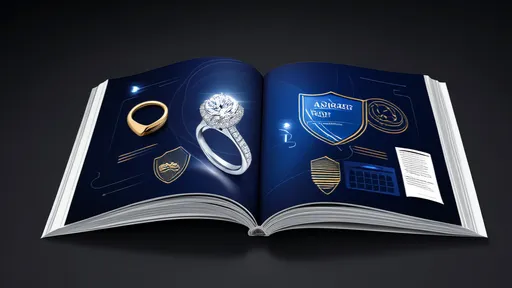
Innovations in technology continue to expand the possibilities for weight balance. Computer-aided design (CAD) allows for precise modeling of visual and physical weight before any material is used. Simulations can predict how a piece will look and feel, enabling adjustments long before production. Laser welding and other advanced techniques enable the creation of complex, lightweight structures that were once impossible. These tools empower designers to push boundaries, creating jewelry that is both artistically daring and eminently wearable.
Ultimately, the art of balancing visual and actual weight is a testament to the designer’s skill and creativity. It requires a deep understanding of materials, a keen eye for aesthetics, and empathy for the wearer. The best pieces are those that feel effortless—where the design conceals its own complexity, inviting admiration without revealing the labor behind it. This balance is not a formula but a philosophy, one that elevates jewelry from mere adornment to wearable art.
As the industry evolves, so too will the approaches to weight management. Sustainable practices may drive the use of lighter, eco-friendly materials, while cultural shifts could redefine what feels "substantial." Yet the core principle will endure: jewelry must delight the senses without burdening the body. In this eternal dance between heft and appearance, designers will continue to find new ways to enchant and inspire, proving that true luxury lies not in weight alone, but in the perfect balance between the seen and the felt.
By /Aug 27, 2025
By /Aug 27, 2025
By /Aug 27, 2025

By /Aug 27, 2025

By /Aug 27, 2025
By /Aug 27, 2025

By /Aug 27, 2025
By /Aug 27, 2025

By /Aug 27, 2025

By /Aug 27, 2025

By /Aug 27, 2025
By /Aug 27, 2025

By /Aug 27, 2025

By /Aug 27, 2025

By /Aug 27, 2025
By /Aug 27, 2025

By /Aug 27, 2025
By /Aug 27, 2025

By /Aug 27, 2025

By /Aug 27, 2025
